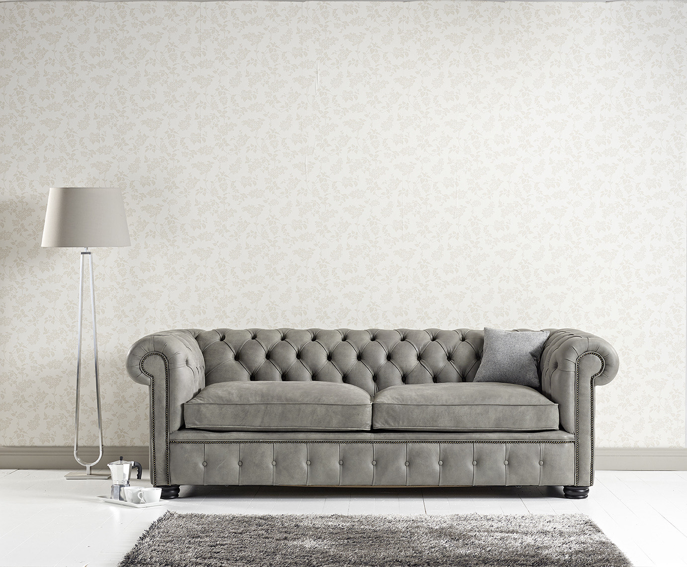
Whether you’ve got a grey velvet sofa and you want to spruce it up, or your planning for a new purchase we’ve got you covered. Our interior experts are sharing their top 5 color combinations to make the most of your sofa, whatever your style.
Bold and bright or subtle and sophisticated; grey is a versatile tone that suits any style.
Find out how to bring your style to life and read on for some serious sofa inspiration.
Grey and Tidewater Green
Green and grey are two colours that simply, just work. Regardless of their tones or shades, these two colours create something beautiful, particularly in interiors.
Grey brings with it a strong, neutral foundation which balances a room opposite an array of colours making it a versatile choice for interiors whether on walls, accents or furniture. Greens, no matter their shade bring us closer to nature and wide open spaces, something that’s never been more relevant than at the moment. Cooped up inside our homes, bringing some of the outdoors in, can help balance your home and make you feel better about being in there, particularly if you make it look stunning.
Tidewater green possesses many of the same characteristics which make us feel safe with grey tones. An equal balance of blue and green combined with its subtle depth of colour and grey undertones this colour mirrors the black and white make-up of a grey; making them completely compatible.
Grey and Salamander Orange
There is no doubt that this colour combination is as contemporary as they come, creating a stark contrast perfect for modernizing a space.
Soothing and serene, greys create the perfect backdrop to experiment with bold colours, without overwhelming a space, and orange certainly fits the bill. Orange brings with it, a feeling of energy and warmth. Traditionally, orange tones have been used to grab attention, which is exactly what to expect when used in the home. Best used in moderation orange will bring a burst of vibrancy to a space which might feel flat. We recommend using orange in small accents and décor, rather than as a wall colour which might over saturate the simplicity of this colour combination.
Grey and Midnight Blue
A real power combination Grey and Midnight Blue create a sophisticated contrast in a space, deep enough to make an impact while removing the ‘risk’ of brighter tones.
Blue Midnight has a unique depth which brings with it a neutrality, perfectly mirroring Grey’s neutral roots. Undertones of purple amplify the luxurious and opulent feeling of a blue, making this tone perfect for creating a lavish feeling in your space.
Although, don’t be fooled by the majesty of midnight blue. When used creatively, it brings a seriously contemporary coolness to a space. Partnered with flashes of orange can create a contrast that feels very modern. Used alongside cooler gold accents and decorative elements, and neutral stone tones this combination can radiate understated elegance, making this a versatile option suited to many styles.
Grey and Amber Yellow
Pantone’s colour combination of the year, Grey and Yellow is a scheme we will see dominating interior design this year. Warming yellows bring an energetic warmth to a characteristically neutral Grey, instantly making spaces feel more open and vibrant.
Yellow is ultimately, a colour that represents happiness, optimism and creativity; perfect for getting really creative with your space and dusting away the cobwebs of 2020 in favor of something more positive. Grey is the ideal backdrop to allow yellow the space it needs to shine, without making spaces feel busy or cluttered.
With the announcement from Pantone, interior stores will have plenty of time to stock up with accents, décor and paint selections designed to make the most of this combination, so if it’s ease you’re looking for this might be the combination for you. Easy to achieve, without compromising on style.
Grey and Dusty Peach
Create a softer pastel impression by coupling Grey with a delicate Dusty Peach.
Once deemed a retro throwback, coral tones are back, with a new revival in the shape of a muted pastel tone. Bringing with it many of the same vibrant feelings as a yellow, it is a great way to inject some positivity into your space without taking the plunge into a shade as bold as a yellow.
A pastel shade, Dusty Peach is more forgiving in terms of use. This leeway lets you get as creative and bold as you like, whether using it on a feature wall and colour blocking or as accent bursts.
If you are thinking about adding some colour to your space, grey is a perfect place to start. A perfect balance of light and dark you can play with both warm and cool colours, without overcrowding your space.